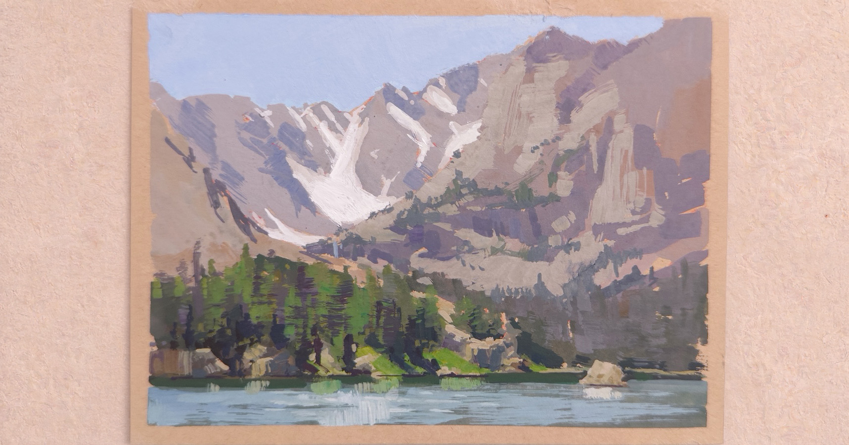
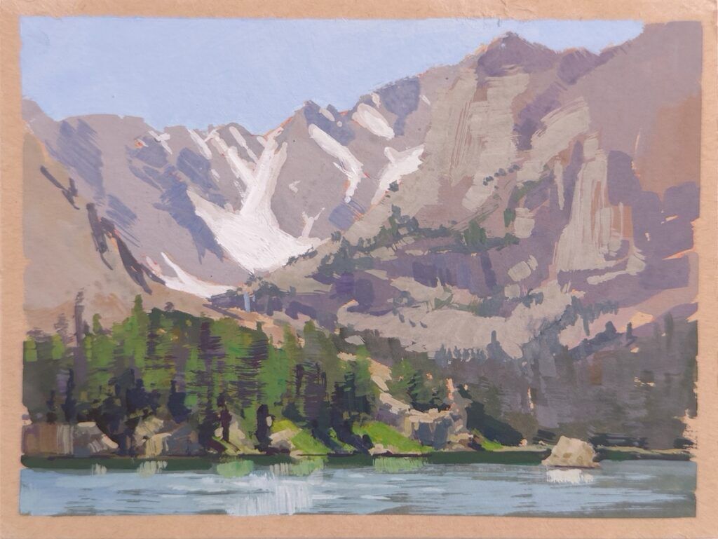
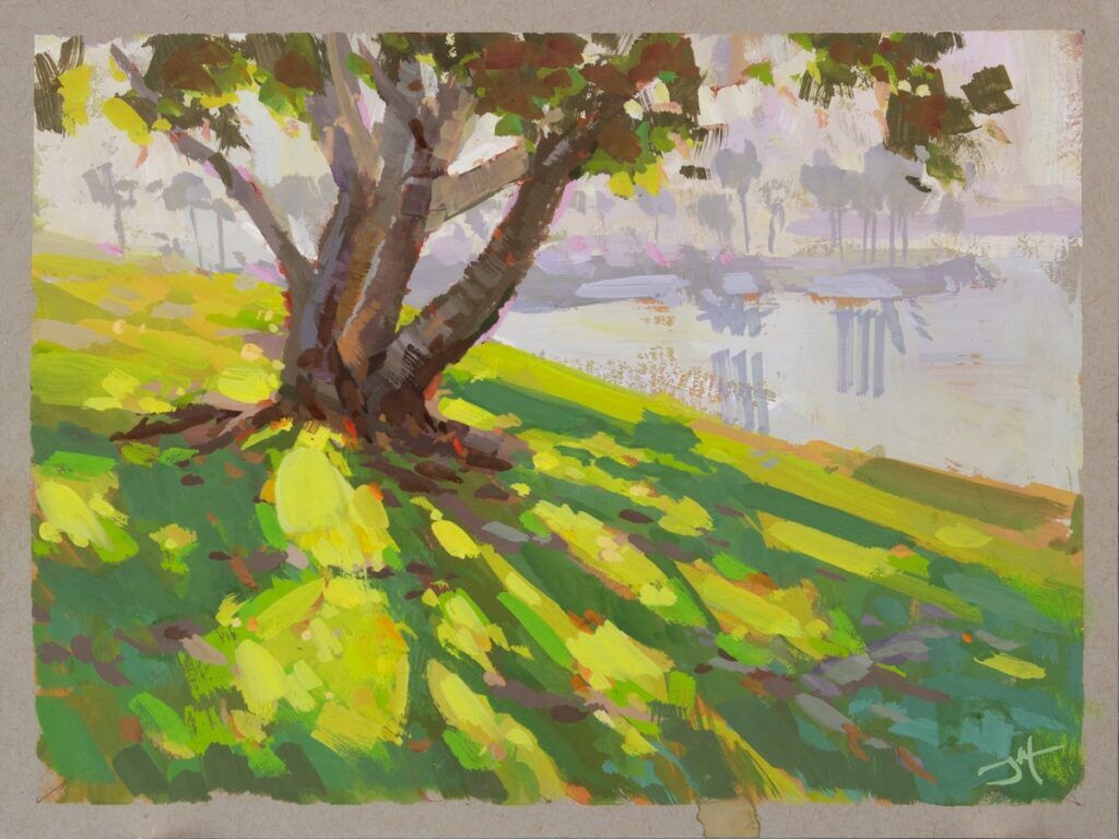
Colorado artist Judd Mercer draws much of his inspiration from nature and the mountainous backdrop of his home state. When it comes to painting en plein air, gouache and toned paper are his materials of choice. “If I only have an hour outside to paint, gouache is the way to go,” he says, noting the medium’s rapid rise in popularity. “It’s the fastest way to paint opaquely without being locked in. I can tear it all down, rebuild it, push and pull. Adjusting color and value is a lot more iterative, so it’s especially helpful when I’m painting outdoors.”
Mercer offers the following tips for painting on toned paper with gouache …
1
START WITH A MIDDLE VALUE
“The starkness of white paper is tricky when it comes to values,” says Mercer. “You’re always painting down, even if something is bright. But if you start with a middle value on a toned paper, then you can go up and down. This also forces you to paint thick since you don’t have transparency as an option, which can be a bit of a crutch. If you find yourself watering paint down in order to lighten things up, you’re working from a watercolor mindset. When working on toned paper, you’ll realize how thin your paint is and how much it needs to be thickened.”
2
BUILD LAYERS FOR INTENSITY
Mercer notes that since gouache isn’t completely opaque, it’s still possible to get a layering effect, even with thick paint. “There’s always going to be some paint that shows through, and that’s a good thing,” he says. “For example, if you’re building up a highlight, you could start with a deep red and then put a warm orange on top of that, followed by a yellow and then a white. Building up the chroma in this way will create a much brighter, glowing effect than just placing a highlight in one stroke on top. Between the toned paper and the paint layers, you can build up the intensity in a way that wouldn’t be possible with a single layer of paint.”
3
PICK A PALETTE BASED ON WHAT YOU REALLY SEE
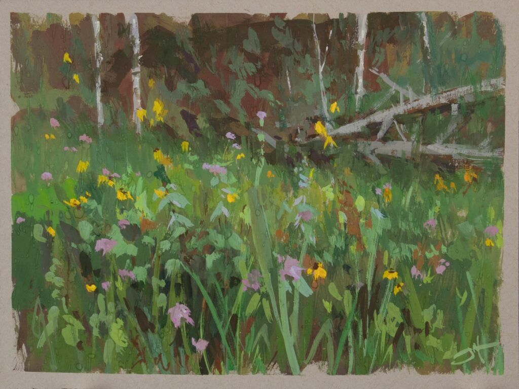
While color is important, Mercer points out that the palette an artist chooses for a painting often has do with personal taste and the artist’s own interpretation of the scene. “I might exaggerate some colors here or there,” he says, “but it’s always based on what I’m seeing. For example, I might notice that the underside of a rock looks warm because the light is bouncing onto it from the trail. And maybe the top of the rock looks purple because it’s catching blue light from the sky. I can crank up the color, but it’s still rooted in the physics of what I’m actually seeing. It’s a balance.”
Judd Mercer hosts workshops both online and in person. He’s represented by Abend Gallery, in Denver.
This article was excepted from the May/June 2026 Artists Magazine. Print and digital issues are available for purchase. Pick up your copy today!